
Cartoon Network Custom Font
Neil Patel

Dynatherm is a custom font developed as part of the 2013 re-brand of the Toonami programming block on Cartoon Network’s Adult Swim. Scott Frizzle and Associates designed the new logotype as part of an updated brand that included on-screen graphics and animation. To support the brand, Scott needed to expand the logotype into a complete character set.
The goal of the custom font was to carry through the modular design of the logotype while maximizing its legibility. While the font was not expected to be used for large bodies of copy, the nature of the design poses character recognition concerns. The inter-letter spacing and the stroke width are very similar in this design, meaning that if too many gaps were present it would be difficult to easily recognize distinct letterforms. To manage this concern, the gap in the letterforms was used sparingly and was limited to the upper third of the letters and to the horizontal orientation. In general, placing the gap where one would expect the beginning of a new stroke worked the best. The figures posed a unique challenge in that a break in the stroke greatly diminished one's ability to distinguish one number from another, particularly amongst the 3, 5, 6, and 9. Since the numbers were most likely to be used for show times and schedules, it was important to make sure these could be recognized easily. As a result, the figures all use unbroken strokes, which in turn prevents confusion with similarly shaped letters.
Another design feature to note is the difference in the “O” used in the logotype vs. the font. This distinction was necessary to prevent confusion with the letter “D.” The font contains an Opentype feature that substitutes in the square-cornered “O” when the word “Toonami” is typed.


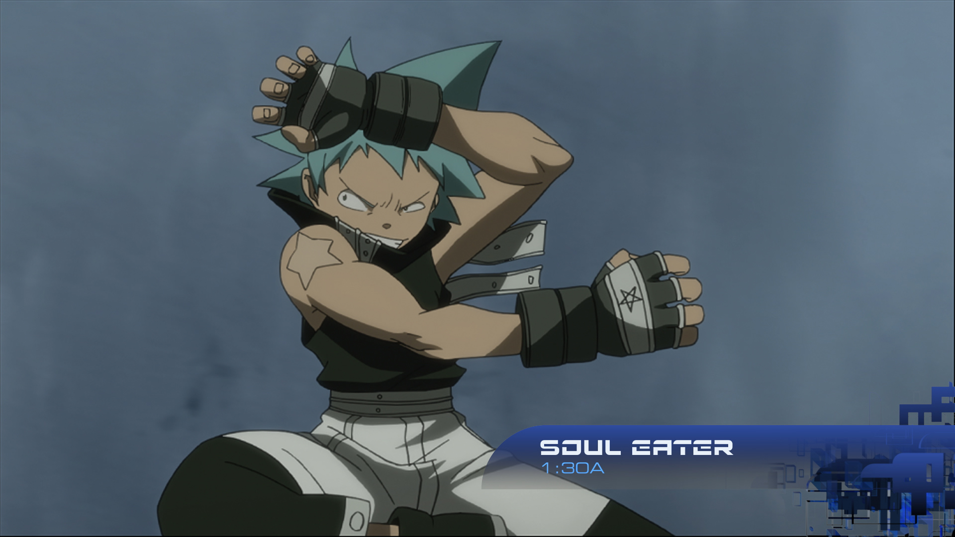


In-use images provided by Scott Frizzle.